How to set up a page with the Reactive Page Builder
Reactive Page Builder makes the management of your website's pages, categories and products extremely easy. Use our fully featured Page Builder to create your own unique pages in just minutes without any coding knowledge at all.
Container and column settings
The container and column settings tab allows you to customize the most important sections of your page.
Container width. Control the width of the container, where elements like text and images are displayed.
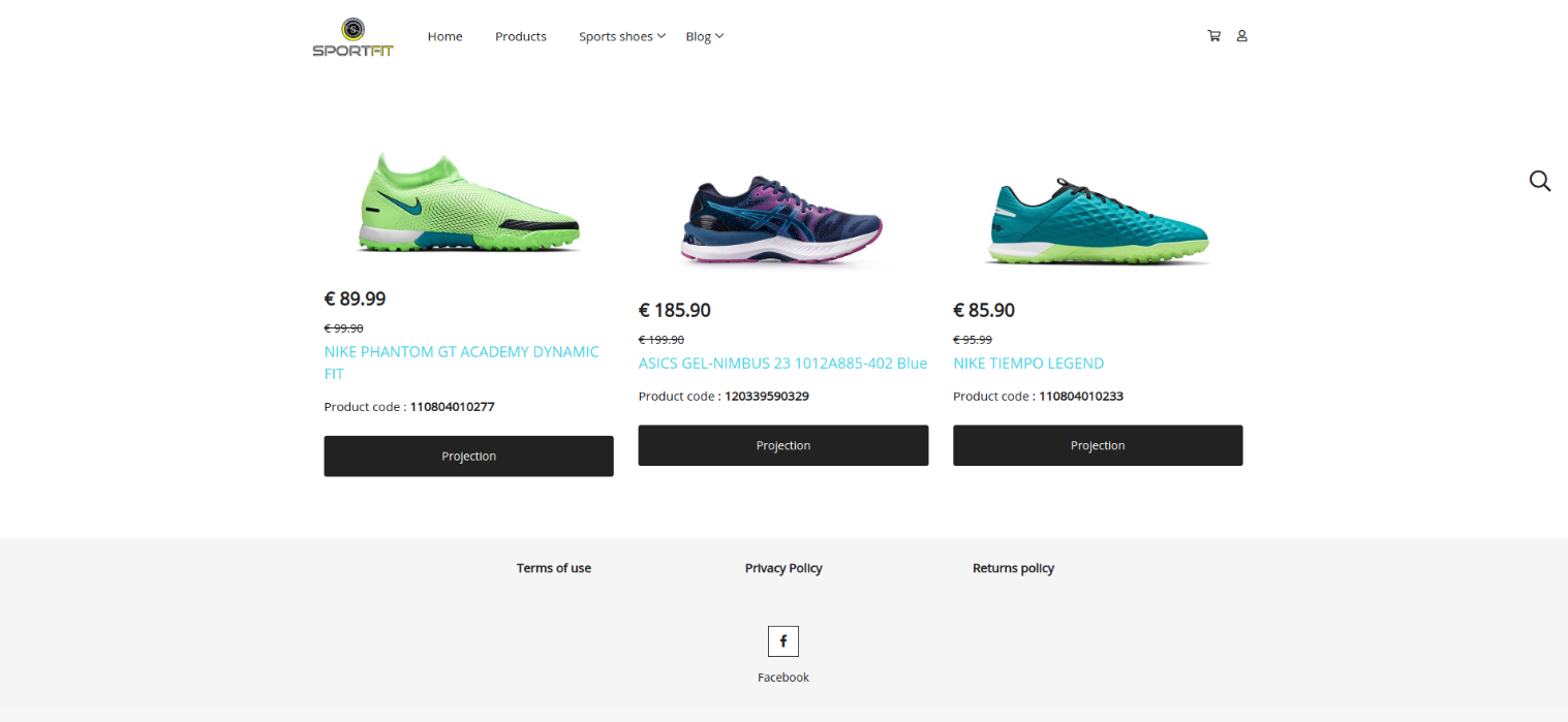
Site width. Content will be adjusted to the width of the site.

Full width. Content will be adjusted to the width of the entire page. For best results, select a transparent header and hide breadcrumbs from the page settings.

The display property is being used for showing, positioning or hiding elements in your layout.
Flex. All the elements will be automatically placed side by side without changing their display behavior.

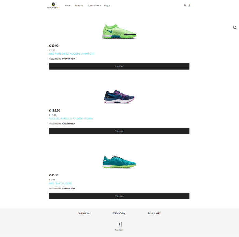
Block. Each element will take the full width of a complete row.

None: This option is used for hiding the container.
Align items. This setting controls alignment of all items on the horizontal axis.
Center. The items are aligned to the center of the horizontal axis.
Flex start. The items are all aligned to the start of the horizontal axis.
Flex end. The items are aligned to the end of the horizontal axis.
Stretch. All the items become the same height.
Justify content. This property controls alignment of all items on the vertical axis.
Center. The items are packed flush to each other toward the center of the container along the vertical axis.
Flex start. The items are packed flush to each other toward the edge of the container depending on the flex container's vertical start side.
Flex end. The items are packed flush to each other toward the edge of the container depending on the flex container's vertical end side.
Normal. The items are packed in their default position as if no justify content value was set.
Space between. The items are distributed within the container along the main axis. The spacing between each pair of adjacent items is the same.
Space around. The items are distributed within the container along the vertical axis. The spacing between each pair of adjacent items is the same. The empty space before the first and after the last item equals half of the space between each pair of adjacent items.
Space evenly. The items are evenly distributed within the container along the vertical axis. The spacing between each pair of adjacent items, the start edge and the first item, and the end edge and the last item, are all exactly the same.
Flex direction. This setting defines how flex items are ordered within a container.
Row. The items are ordered the same way as the text direction, along the main axis.
Column. The items are ordered the same way as the text direction, from the top to the bottom.
Margin & Padding. Use these powerful tools for spacing out your elements.
Margin. This setting allows you to control the space around an element’s border by changing the top, bottom, left and right values.
Padding. This setting allows you to control the space between the content and borders of an element by changing the top, bottom, left and right values.
Border style. This property sets the line style for all four sides of an element's border. Choose between none, solid, dotted, double or dashed.
None. This style displays no border.
The border radius property rounds the corners of an element's outer border edge. The border radius can be set as a percentage or a specific size in pixels.
Border color. This property allows you to set the color of an element's border and create the look you want.
Background color. In this section you can specify the background color of your element.
Link. This property allows you to make a section of your page clickable. Simply insert the link that you would like to direct your customers to. You can include links to several different elements (columns, text, images, icons, buttons etc.)
Link target. Set how the link opens. Choose between "Open link in same tab" for the same window or "Open link in new tab" for a new tab.
Once you have created your container you can add a column.
Click the pen icon to edit the column settings. Then you can add elements to the columns.
Anything you create with Page Builder automatically adapts to mobile devices.
If you want to change the order of your items simply drag and drop them to the desired position.
Below is a list of the available elements in Reactive. Click the element below that you’d like to know more about, to be directed to the corresponding element documentation.
Related Articles
How to create a Page
To create a page navigate to the Pages section from the sidebar menu of your admin panel under Website and click on the "Create" button that appears on the top of your screen. Pages include a few settings allowing you to fully customize the way pages ...How to set up your homepage?
Here are the steps you need to follow in order to set up your homepage. From your Reactive admin, go to Website > Pages. Click on the "Create" button that appears on the top right of your screen. Give your page a title. For example,"My homepage". ...What do I need to do in order to set up my new Reactive Online Ordering store?
After you have successfully registered for your Reactive Ordering Store there are a few things you need to know in order to set it up and start accepting orders. Here is what you need to do: We have prepared a short onboarding tour to help you set up ...How to integrate Reactive Ordering with Wolt
To get started, you must have an active partner account with Wolt. To create an account with Wolt, click here. Once Wolt activates your account, they will provide you with the necessary details for the technical connection: Order API key Menu API ...How to set up your Blog
Reactive comes with built-in functionality to create your own blog. Here are the steps you need to follow in order to set up your blog for the first time. 1. Start by creating a new page from the pages section (Website > Pages). Give your page a ...